


Creating a page layout in CSS is not the easiest of things to do while building, and designing your web application. Different solutions were introduced over the years to overcome challenges that arose, but alas no real solution was introduced. Until flexbox arrived and that changed a scenery a bit. Flexbox was the first to actually provide the web with a sense of how responsive layout in the web is supposed to look like, and it did that really well, and so people started using flexbox instead of tables, floats or whatever other methods used in those crazy times before.

Then CSS Grid has appeared, and with good browser support after a while, I think it is safe to say that it is here to stay. So what happened did it come to replace flexbox which was introduced not too long ago?
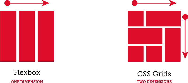
Well, it’s not. Although Grid has a lot of cool new features including two-dimensional layout as opposed to flex which handles only one direction at a time. Still flex also has its own advantages, and it doesn’t mean you will stop using it from now on. There are pretty good articles out there explaining how both can live and work together pretty well.
I have decided to split this into two parts because I would like to dive into the technical specifications and how things work without spewing a lot of data at once. This way you can also get a better feeling of how things work by understanding the layout with Grid in a two-step process.
So let’s start with the basics:
First, as with flexbox (if you are already familiar with), you have to define your container. This is done like so (Am going to work with the class container throughout this small guide):
.container {
display: grid;
}
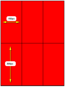
This declares the container as a grid, the second step would be considering your page layout and deciding the number of columns and rows needed to get you started. After you are done you can declare the columns and rows like this:
.container {
display: grid;
grid-template-columns: 150px 150px 150px;
grid-template-rows: 300px 300px;
}
This would split the items(Cells) inside the grid container into 3 columns with a fixed width of 150px, and two rows with a fixed height of 300px. This can be done differently using the “grid-template” property and dividing your choices with a “/” like so:
grid-template: 150px 150px 150px / 300px 300px;
End result will look something like this (Please note that your html will have the minimum number of divs/elements required to fill the grid to actually get this result right) :
As you can see how simple it is to create a grid and get started. In this post I only wanted to give you a taste of how Grid got into our lives and how easy it is to use. Follow us next to really get the hang of what this powerfull tools can really do and all of its really cool and handy new features that comes with it. Thanks again for being with us and hope you enjoyed the read.
By Yousef Shamshoum